What Colors Look Best on Camera
Color choice can elevate a photo or completely ruin it.
On camera, colors behave differently than they do in real life, and understanding this is essential for professional-looking visuals.
Whether you’re preparing for a photoshoot, video content, or personal branding, here’s what actually works.
1. Solid Colors Almost Always Win
When in doubt, choose solid colors.
Busy patterns, heavy prints, or large logos can distract from your face and create visual noise. Cameras capture detail sharply, and complex patterns may pull attention away from you.
Solid colors:
Keep the focus on your expression
Look clean and professional
Photograph consistently under different lighting conditions
Age better over time
If your goal is timeless photos, simplicity is your strongest strategy.
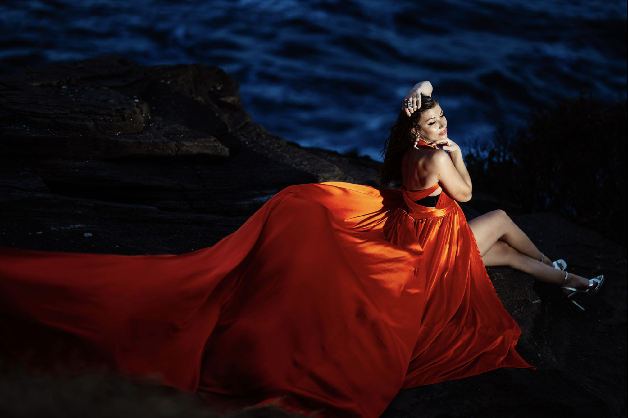
2. Jewel Tones Look Rich and Flattering
Deep, saturated colors tend to photograph beautifully.
Jewel tones such as:
Emerald green
Sapphire blue
Burgundy
Deep plum
Teal
These shades add depth without overwhelming the image. They create contrast, enhance skin tones, and feel elegant on camera.
Jewel tones are especially effective for:
Branding sessions
Engagement photos
Studio portraits
Professional headshots
They communicate confidence and sophistication.
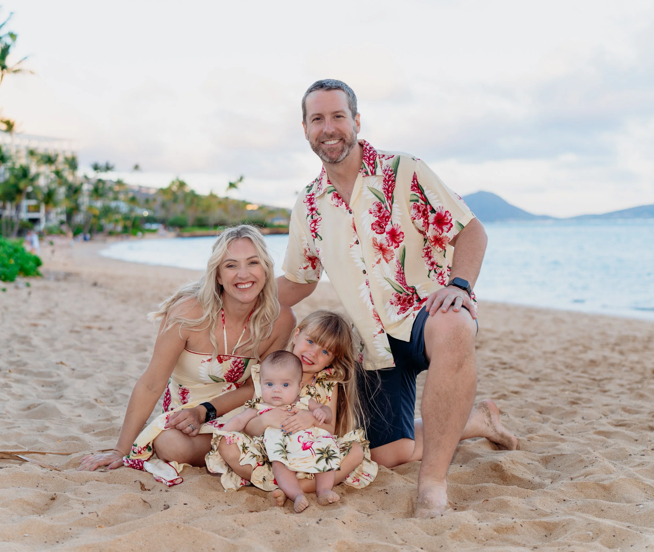
3. Soft Neutrals Create Timeless Images
Neutral tones are safe, refined, and versatile.
Colors like:
Beige
Cream
Soft gray
Light taupe
Muted earth tones
These shades feel natural and allow light to reflect evenly. They are particularly beautiful in outdoor sessions where natural light enhances texture and warmth.
Neutral colors are ideal for:
Family photography
Lifestyle shoots
Minimalist branding
Real estate marketing imagery
They rarely clash with backgrounds and maintain a clean aesthetic.
4. Avoid Extremely Bright or Neon Colors
Very bright or neon shades can be problematic on camera.
They may:
Reflect unnatural light onto your skin
Appear overly saturated
Distract from facial features
Create color imbalance in the image
Neon pinks, highlighter greens, and intense oranges often dominate the frame. While they may look bold in person, they rarely translate well in professional photography.
If you want bold color, choose deeper tones rather than fluorescent ones.
5. Consider Your Skin Tone
The best color for you depends partly on your natural undertone.
If you have warm undertones, shades like olive, mustard, coral, and warm reds often complement your complexion.
If you have cool undertones, blues, purples, and cool-toned greens typically enhance your natural coloring.
Testing outfits in natural light before your session can help you see how colors interact with your skin.
The goal is harmony — not contrast that feels harsh.
6. Coordinate Without Matching Exactly
For couples or group sessions, coordination matters more than matching.
Instead of everyone wearing identical outfits, choose a cohesive color palette.
For example:
Cream + soft blue + light gray
Olive + beige + white
Navy + tan + muted burgundy
This creates visual balance without looking overly staged.
Subtle variation adds depth to group portraits and prevents images from appearing flat.
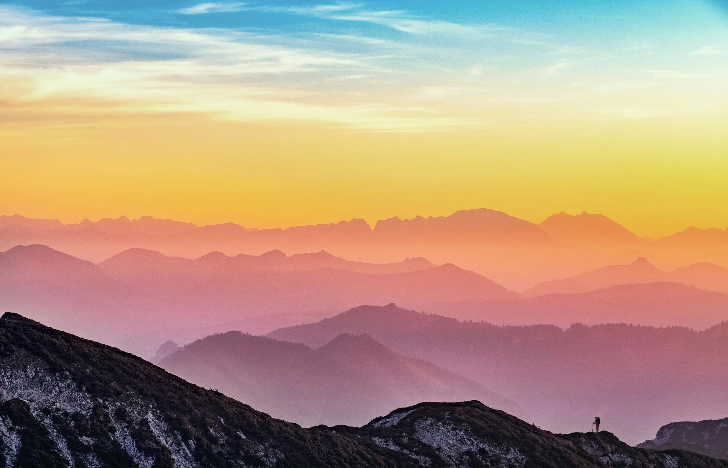
7. Think About the Location
Your environment influences which colors work best.
For outdoor greenery, avoid wearing the exact same green as the background — you may blend in too much.
For urban settings with neutral buildings, rich tones like burgundy or navy can stand out beautifully.
For beach sessions, soft whites, light blues, and sandy neutrals complement the environment naturally.
The key is contrast that feels intentional rather than forced.
8. Texture Matters as Much as Color
Color is important, but texture enhances visual interest.
Materials like:
Linen
Silk
Structured cotton
Wool
Subtle knits
Add depth without distracting patterns.
Texture catches light differently and gives dimension to the photograph.
The best colors on camera are those that enhance you — not overpower you.
Choose:
Solid over patterned
Rich tones over neon
Coordinated palettes over exact matching
Colors that complement your skin tone
Shades that align with your setting
When thoughtfully selected, color becomes a powerful tool. It shapes mood, strengthens composition, and supports timeless imagery.
Whether preparing for a branding shoot, engagement session, or professional portrait, intentional color choices ensure you look confident, polished, and natural on camera.
Explore the gallery for more examples of weddings, families, maternity, and portraits.
View all photoshootpackages and pricing to find the session that fits your vision.